Curves
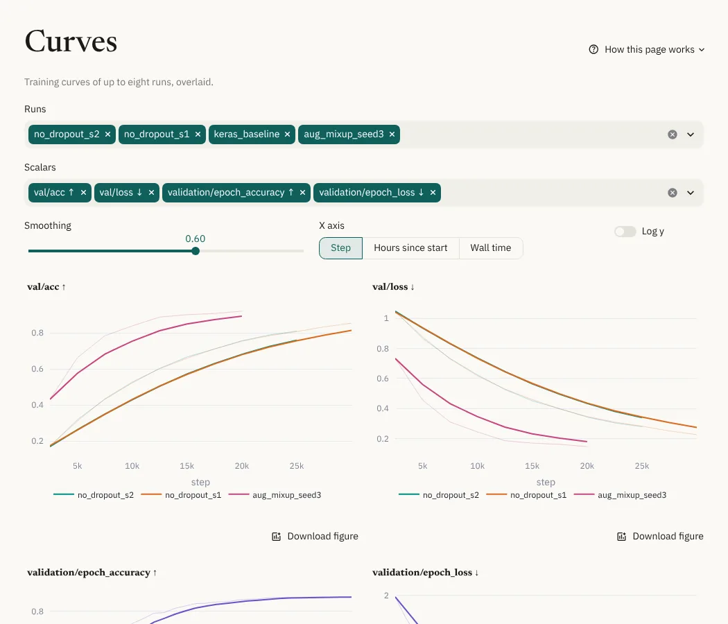
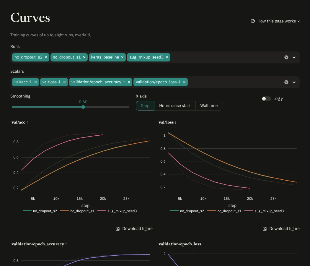
Overlays training curves of up to eight runs.
- Runs and Scalars: one chart per scalar, one line per run. Each run keeps its color while you add or remove others.
- Smoothing: the same debiased exponential moving average as TensorBoard. The faint line is the raw data.
- X axis: steps, hours since the run started (to compare speed), or wall time.
- Log y: logarithmic y axis.
- Overlay scalars: below the charts, draws several scalars of the chosen
runs on one chart, to compare scalars on the same scale (for example
train/lossandval/loss). It starts with scalars that share a name after the last/. Color by run or scalar; the other one is told apart by the line style.
Long curves are thinned to at most 5000 points for plotting, always keeping the first, last, lowest and highest points. Values in tables are always computed from every point.